Sunday, December 15, 2013

Issue #5, Romulan Warbird, and Issue #6, U.S.S. Voyager

"Engage cloaking device."

I'm super stoked this month, because this shipment includes what might very well be my favorite ship in all of Star Trek: the Romulan D'deridex-class Warbird.  Oh, and the U.S.S. Voyager, but we'll get to that later.  For now, arm disruptors!

Issue #5, Romulan Warbird


As I indicated above, the TNG-era Warbird is at or near the top of my list when talking about Star Trek starships.  Beautiful yet functional, elegant yet menacing, when this emerald raptor appeared on the screen, you knew shit was about to get real.

The magazine has several interesting passages regarding Romulan society and culture, a subject only briefly and infrequently touched on in The Next Generation and subsequent films; particularly the prominence of Romulan women, an element described as "both alien and radical" in 1968.


"Designing the Ship," in this issue, is particularly intriguing because it suggests something we haven't really seen in Star Trek: a vertically-oriented ship design.  Designer Andrew Probert wanted to position the warp nacelles above and below the primary hull, rather than to the sides, but this was deemed too radical a departure by the producers.  Probert rotated the "wings" ninety degrees, reshaped the nose a little, and the iconic D'deridex-class was born.


The model is gorgeous: sharp details, lovely paintwork, and a heavy, solid feeling in the hand make this one a winner.   Unfortunately, I have to knock points off for the stand.  It doesn't grip the model the way the Klingon Bird-of-Prey's stand does, nor does it support the model from underneath the way the Enterprise refit and the Enterprise-D stands do.  The Warbird is extremely prone to slipping out of the stand at the slightest provocation; don't display this in an area with lots of vibration, or you'll be putting the Warbird back on its stand every time you turn around.


Here, I'm experimenting with the photography, trying to get a more dynamic perspective shot.  I'm not really happy with it, though I do have some ideas for improvement.  The background, if you're interested, is a view from Apollo 11, showing Earth rising beyond Luna's limb.

Issue #6, U.S.S. Voyager


I'm going to be honest, I was never as big a fan of Voyager as I was, say, Deep Space Nine.  I'm not really sure why, but the show just never really grabbed me.  Fortunately, it didn't have anything to do with the ship.

One interesting tidbit in the magazine is the answer to a question I've had ever since Voyager's first episode: what the hell is that indentation in the upper saucer section?!  You know the one, the thing that looks like a launch tube.  Well, it turns out that's supposed to be an auxiliary deflector dish.  It doesn't look it to me, but OK.

"Designing the Ship" is very interesting in this issue, because it shows the numerous different versions of the ship that existed on paper (and, occasionally, as CG models) at various points.  Several of these are radically different from what was eventually approved, and a few are, frankly, fugly.  It's easy to see that the elongated primary hull is carried through from the very earliest design sketches.  The article also mentions that the variable-geometry nacelle pylons are the result of a requirement from the producers that some part of the ship be articulated.  Another possible fulfillment of this, that never made it into the final design, would have been panels that swung out from the sides of the nacelles themselves.

One element of the Voyager's design that I particularly like is the fact that the primary hull is joined directly to the secondary hull, without the ungainly neck of the Constitution and Galaxy classes, among others.


Also of interest is the laughably named AeroShuttle.  Like the Captain's Yacht aboard the Enterprise-D, this is an auxiliary craft hinted at in the ship's design but never seen on screen.  Related to the Danube-class runabout, the addition of wings supposedly made the AeroShuttle more suited to atmospheric operations.  Let's not mention the fact that the "wings" aren't shaped right to be airfoils, or that there isn't a single visible lifting surface anywhere on the craft.  Sorry, my aviation-enthusiast snobbery is showing.


Like the Romulan Warbird, the model itself is lovely.  The less monochromatic hull allows the details to stand out a little better.  As with the other five models to date, the paint is impeccable, and overall the ship looks fantastic on its stand.

The stand, for its part, suffers from the same flaw as the Warbird's: it doesn't grip or snap onto the model at all.  The end result isn't quite as bad as the Warbird stand, due to the attachment points being squared off rather than tapering, but it still warrants caution when moving and displaying the model.


More experimentation.  Again, I'm not thrilled with the result; it could be worse, but there is also lots of room to improve.  Fortunately, I do have some ideas on that score.  Hopefully I'll find time to work on them, and will be able to show off a little bit in the next post.

Next post: Issue #7, K't'inga-class battlecruiser, and Issue #8, U.S.S. Excelsior

Thursday, November 21, 2013

Issue #1, U.S.S. Enterprise NCC-1701-D, and Issue #2, U.S.S. Enterprise NCC-1701 (refit)


 Problem solved!


Issues 1 and 2 have arrived, along with the first of my subscriber extras (more on that later).  So, without further ado...

Issue #1, U.S.S. Enterprise NCC-1701-D


Much like issues 3 and 4, the magazine kicks off with a ship profile, written from an in-universe perspective, which goes into the design and history of the ship.  This offers several interesting tidbits; for instance, the Enterprise D's 42 decks covered 3.5 million square meters, and offered 110 square meters of living space per person.  There were three different sickbays (presumably the series only showed one to reduce production costs) and over a hundred research labs for various disciplines.

Next is a feature called "Classic Scene," which also appears in issue 2, but not in 3 or 4.  In this case, the classic scene is the saucer separation maneuver.  According to Memory Alpha, this was intended to be a regular feature on Star Trek: The Next Generation, but was scaled back due to the cost of filming additional scenes of the two sections.  A sidebar mentions that the original Enterprise was also supposed to have this ability.

"Designing the Ship" and "Filming the Ship" continue to be the meat of the magazine, in my estimation.  "Designing..." relates an amusing anecdote about writer/producer David Gerrold essentially shanghaiing a preliminary sketch from concept artist Andrew Probert, taking it to a producers' meeting, and returning to tell a flabbergasted Probert that this sketch would be the new Enterprise.  Also of interest are several early design sketches showing different versions of the saucer and battle sections.

"Filming..." has a juicy tidbit regarding the difficulty in establishing the "correct" color of the Enterprise D.  As designed, she was meant to have a blue-green color, hearkening back to the VFX techniques of the original series.  This meant that newer bluescreen techniques wouldn't work, however, so the lighting was adjusted to make the ship grey.  Hence the difficulty: the model, and the ship shown on the screen, are two different colors.


As you can see in the above photos, Eaglemoss' Enterprise D model is the pearl grey from the screen.  As with the Bird-of-Prey and NX-01 models, the detailing is really impressive.  Some (phaser banks, escape pod hatches) are cast into the model, while others (windows, registry numbers) are painted on, but they're all outstanding.  There are even tiny, tiny navigation lights in the form of a pinprick of green paint on the starboard (right-hand side, facing forward) underside of the saucer section, and a matching red pinprick on the port side.  It's hard to imagine a model being more definitive than this without increasing the scale to an impractical size.

Issue #2, U.S.S. Enterprise NCC-1701 (refit)


The ship profile in issue 2 deals mainly with the refit of the ship from the form seen in Star Trek: The Original Series to that seen in Star Trek: The Motion Picture, Star Trek II: The Wrath of Khan, and Star Trek III: The Search for Spock.  A sidebar mentions that the refit Enterprise's main deflector only glowed blue when at warp, changing to a "golden" color at impulse.  I recall no such feature, and a quick Google image search shows the ship with a blue-glowing deflector in every shot.  Possibly this was a part of the script that never made it to screen.

The "Classic Scene" feature in this issue deals with the drydock scene in Star Trek: The Motion Picture.  It's only two pages, and most of those are taken up with photographs, but it does mention that, while the scene only occupied two pages in the script, it took forty-five days(!) to film, and was the longest continuous FX shot in film history to that point.

"Designing the Ship" talks a little bit about original Enterprise designer Matt Jefferies' (after whom Jefferies tubes are named) initial work on an updated design for the proposed-but-never-shot TV series Star Trek: Phase II, before going on to Motion Picture art director Richard Taylor's hiring of concept artist Andrew Probert (that name sounds curiously familiar...).  The article talks a bit about Taylor's Art Deco influence, seen most clearly in the warp nacelles; Taylor describes the forward ends of the nacelles as "almost a 1940 Ford grille."  "Designing..." closes with a few paragraphs about some of the inside jokes incorporated into the model, including photos of Mickey Mouse, Probert, and others visible in some of the windows.

"Filming the Ship" has some good info about the model constructed of the new design.  At eight feet long and weighing 39kg (86 pounds), it was actually about a third the mass of the 125kg (275.5 pounds) model built for the original series.  The paint, a glossy lacquer, caused problems with light flare, limiting the kinds of shots that could be used.

 While the model in this issue obviously has far fewer greebles than the other three I've received, I really can't say that it's any less detailed.  It is, after all, screen-faithful, and the screen model was built before the advent of extensive greebling on scale models.  One detail in particular that I'm glad to see is the slight concavity of the saucer's underside.

This is the first model I've received whose construction is less than perfect: the saucer is not quite mounted straight on the neck.  It's only apparent if you're specifically looking for it, and I only noticed it when I mounted the model to the stand and saw that it didn't sit square in the middle of the brackets.  It's a minor and forgivable blemish.


Another detail I want to mention is the "windows" in the nacelles.  They're made of a translucent blue plastic that glows quite nicely when held up to the light.  The Enterprise D and NX-01 models also have this feature, but the windows are smaller and the effect doesn't photograph well.


Finally, this package also included my first subscriber gift, a binder in which to keep the magazines; and a "Series Guide," an advertising pamphlet selling the collection.  I am particularly looking forward to the Klingon K't'inga-class battlecruiser, the U.S.S. Excelsior, and the U.S.S. Reliant (I have a soft spot for the Miranda class).

I continue to be favorably impressed with Eaglemoss' work.  Next post: Issue #5, Romulan Warbird, and Issue #6, U.S.S. Voyager.

Monday, November 18, 2013

Issue #3, Klingon Bird-of-Prey, and Issue #4, Enterprise NX-01

Knoxville Fleet Yard is operational

Hello, and welcome to the first installment of Knoxville Fleet Yard, a collection blog covering the Star Trek Starships partwork magazine by Eaglemoss, Ltd.  The magazine is published bimonthly (or fortnightly, if you prefer), but as a subscriber I get two issues together once a month.  Therefore, this blog will update monthly, with each post covering two issues.

I had hoped to begin with issues #1 and 2, but there's some irregularity with the mail, and the first package to arrive contains issues #3 and 4; so we'll begin in medias res, as it were.

Issue #3, Klingon Bird-of-Prey

Each issue consists of two parts: the actual magazine, and a model of the ship, seen below.


I'm writing this having given the magazine only a cursory flip-through, but it looks interesting.  Going by these two issues, it looks like each magazine is going to follow the same format of five articles: the first, named after the ship ("Bird-of-Prey," in this case) and second, "In Action," have in-universe information on the ship, its technology, and its operations.  There are some interesting details here, but much of it is familiar to Trekkies like me.

Moving on to the third article, "Designing the Ship," we get to what is, in my opinion, the real meat of the magazine.  True to its title, "Designing..." is all about the behind-the-scenes process of designing the ship, its inspiration, and the thought process that went into it.  Lots of really neat information here; I didn't know that Leonard Nimoy, who directed Star Trek III in addition to playing Spock, actually instigated the need for the Bird-of-Prey design.  The characteristic movable wings are actually inspired by the image of a bodybuilder flexing his biceps downwards, giving the Bird-of-Prey an aggressive profile in attack mode.

The fourth article, "Filming the Ship," is all about the technical details of the model and the techniques used to shoot it.  Again, there's lots of good stuff here.  The original shooting model of the Bird-of-Prey was fifteen inches long by thirty-six wide, incorporated motors to raise and lower the wings so they could be filmed in motion, and was eventually auctioned off at Christie's in 2006, where it fetched $250,000.  Amusingly, to film a fleet of Klingon ships in the Deep Space Nine episode, "The Way of the Warrior," the VFX team used Hallmark Christmas ornaments, which were cheap enough to be destroyed without needing to damage the main shooting model.

Finally, at the back of the magazine, is "On Screen," a one-page summary of the ship's main appearances and some trivia.

Overall, the magazine is everything that could be hoped for, considering that the real draw is the model.

On that note...


I'm really very impressed with the model.  It's highly detailed, with lots of little greebles, and the painting is top-notch.  As seen in the scale photo, the Bird-of-Prey is just about 5¼ inches from wingtip to wingtip.  It's quite substantial and well-made, partly of metal and partly of plastic, and not really fragile at all.  Mind you, I won't be throwing it about, but it seems like it will stand the test of time.

The base is surprisingly heavy for its size, which I'm also very pleased with, as it makes the model less likely to tip over.  The stand attaches to the rear of the model without the need for extraneous hole or cavities, and so doesn't interrupt the design at all.  It's clear that somebody put real thought into this, and I'm very happy with that.

This is the first time I've dealt with Eaglemoss, and my impression is overwhelmingly positive...  with the exception of the difficulty getting the first two issues.  To be fair, I really cannot say that this is their fault, though.  Hopefully it will be resolved soon, and I'll be able to post what should have been the first installment of this blog.

Issue #4, Enterprise NX-01


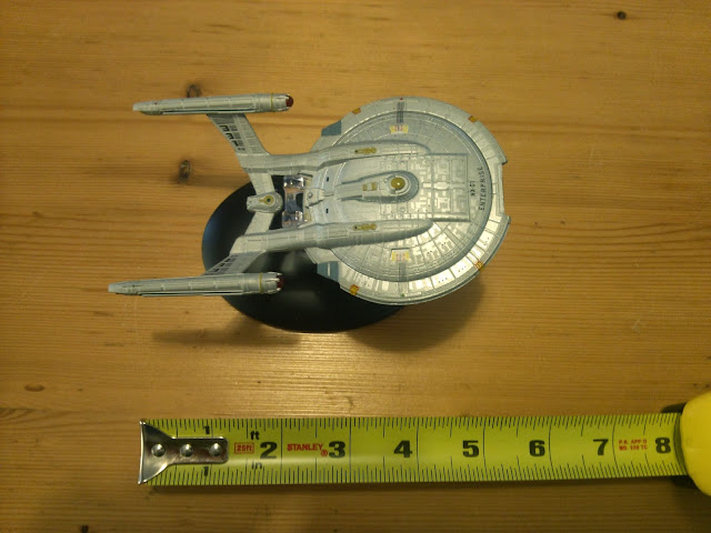
 I have to say, I am completely on board with the idea that the NX-01 looks far too advanced for the time period she supposedly occupies in the Star Trek timeline.  The combination of the round warp nacelles and the sleekly curved saucer make her look far more like a transition from the original NCC-1701 to the Excelsior-class, than like a predecessor to Kirk's Enterprise.  That's just my feeling, though, and should not in any way be taken as a slight on Eaglemoss' excellent model.

Like issue #3, the magazine starts out with in-universe talk about the ship's history and place in the Star Trek canon, before moving on to "Designing the Ship" and "Filming the Ship."

"Designing..." is particularly interesting to me, as it lays out a lot of the (to me) wrongheaded thinking that went into the NX-01.  The most damning element is a production sketch by concept artist John Eaves:


"John Eaves started the design work on the NX-01 and explored
various ways it could be made to look like an earlier version of Kirk's ship."


Now, I don't know Mr. Eaves, and certainly have no wish to malign him.  I just can't wrap my head around his thought process here.  If anything, this sketch reminds me most strongly of the Sovereign-class Enterprise, NCC-1701-E.  The aerodynamic (spatiodynamic?) curvature, the steeply-raked neck between the primary and secondary hulls, all speak to me of a late-24th-century design rather than a mid-22nd-century one.

Bah, I'm rambling.  Getting back to the actual magazine, the articles about the initial design and proposed evolution of the NX-01 are legitimately interesting, well-written, and accompanied by very cool images.  As I've been writing this, I've also been flipping through the magazine, and I've discovered that the article listed in the contents as "Filming the Ship" is actually titled "Becoming the Enterprise NX-01.5."  This is about designer Doug Drexler's idea that, as Star Trek: Enterprise progressed, the NX-01 would have been refitted on a regular basis, eventually acquiring a full-size secondary hull quite reminiscent of the NCC-1701.  The CG image accompanying this is quite lovely, depicting the refitted NX-01 in the shipyard and looking much more like the experimental forerunner to Kirk's Enterprise.

Moving on to the model:


Again, I'm extremely pleased.  It's a nice size, with wonderful detailing and an excellent paint job.  Like the Bird-of-Prey, the NX-01 model is about 5¼ inches in her longest dimension, and comes with a nice heavy base and a stand that clips on without interrupting the model at all.  The only way I could be more pleased with these models is if they had functional warp drives.

Yes, 5¼ inches is the perfect size for flying around the house, making warp-drive and phaser noises with my mouth.